
A collection of digital experiences, identities and creative collaborations.
A collection of digital experiences, identities and creative collaborations
Branding
UI/UX
Web Design
Print Design
Selected Collaborations
A collection of digital experiences, identities and creative collaborations.
Not every collaboration needs a full case study. This collection brings together smaller projects with a clear problem, a focused solution and meaningful work behind them.
Selected Collaborations
SparkOptimus
My work in the Rijksmuseum
My artwork was exhibited at the Rijksmuseum in Amsterdam!
For the launch of SparkOptimus’s book Make Disruption Work, I reimagined a series of historic portraits by placing the newly released book into their hands, bringing a contemporary message about disruption into classical imagery.
The artworks were displayed throughout the museum during the launch event, attended by more than 200 guests. Seeing my work hanging inside the Rijksmuseum, and watching visitors stop to photograph it, was a genuinely surreal and proud moment.
About the event↗
Services
Creative Direction · Promotional Artwork · Graphic Design
Selected Collaborations
ODC Logistics
One identity across every customer touchpoint
ODC Logistics needed one clear identity that could work across every customer touchpoint and grow alongside the business.
I created the website, iconography, brochures and business cards, bringing everything together within one consistent visual system. The digital work included the information architecture, user flows, wireframes, interface design and development of a responsive WordPress website built from scratch.
Beginning with competitor research and a practical style guide, I established the color, typography, hierarchy and iconography that shaped every application. The resulting system gave ODC Logistics a more credible and professional presence, supported sales and continued to scale as the company grew in both revenue and employees.
View live website↗
Services
Brand Identity · Iconography · UX Design · Website Design & Development · Print Design
Selected Collaborations
Duckie Wonderland
A private webshop that became the blueprint for physical stores
I designed and built Duckie Wonderland’s webshop, translating its playful brand universe into a distinctive online shopping experience. The platform used restricted access: visitors could explore the collection, but prices only became visible after logging in.
More than an online store, the website established the visual and commercial direction for the many physical Duckie Wonderland stores that followed. It became a benchmark for how the brand could look, feel and behave across future locations.
View live website↗
Services
UI / UX Design · Website Design & Development
Selected Collaborations
NAHst (Non-Profit)
Making support feel visible, welcoming and accessible
NAHst is a non-profit organisation that brings people living with acquired brain injuries together through activities, shared experiences and meaningful social contact.
I created the organisation’s identity from scratch, including its logo, style guide, business cards and custom-built website. The friendly brain symbol makes NAHst’s purpose immediately recognisable, while the vivid green and pink palette gives the organisation an optimistic and approachable character.
Accessibility played an essential role in the website. Its content follows a clear, logical structure and includes speech functionality and descriptive alternative text, helping people with visual impairments navigate and understand the site more easily.
The result is a consistent and welcoming identity that gives NAHst a recognisable presence across both digital and printed communication.
Services
Brand Identity · Logo Design · Style Guide · Print Design · Accessibility · Custom HTML & CSS Development
Selected Collaborations
MCV
Turning sound into a recognisable identity
MCV provides lighting, sound, production and technical support for theatres and events. I created a new logo and business card system to give the company a more professional, recognisable presence.
The process began with research into the world surrounding MCV: live events, stage lighting, audio equipment and the technical structures behind a successful production. These references formed a moodboard that helped define the identity’s shapes, colours and overall character.
From there, I moved to pencil and paper. Sketching by hand allowed ideas to develop freely before the strongest concepts were translated into digital variations and refined together with the client.
The final symbol is inspired by audio levels and sound waves. Its geometric rhythm reflects MCV’s combination of sound, lighting and technical expertise, while the red, black and white palette gives the identity a confident and highly visible appearance.
The completed identity was applied to business cards and delivered as a flexible set of production-ready files for digital, print and large-format use.
About MCV↗
Services
Research and moodboarding · Logo design · Visual identity · Business card design · Print preparation · Brand asset delivery
Selected Collaborations
Leiden Marathon
A clearer website. Record participation.
I redesigned and developed the Leiden Marathon website to make discovering events and signing up feel clearer, faster and more inviting.
User research helped uncover what motivates runners and what information they need before committing to a race. These insights shaped the website’s structure, user journeys and wireframes before being translated into a bold, energetic visual design.
The final website was developed as a custom WordPress solution, creating a flexible platform that the organisation could easily manage and expand. Following its launch, Leiden Marathon received a record number of registrations across its running events—a fantastic result for the new experience.
View live website↗
Services
User research · UX and UI design · Information architecture · Wireframing · User flows · Custom WordPress development
Selected Collaborations
INDIANAH
Giving a first Dutch-language single its own visual voice
INDIANAH approached me to create the artwork for Kom Je Naast Me Liggen, their first single released in Dutch.
The design combines intimate photography with bold, oversized typography inspired by early twentieth-century type specimens. Its slightly roughened character gives the artwork a tactile, expressive quality while remaining instantly recognisable across different imagery.
The final visual system was adapted for the single cover and promotional assets, with every format prepared for use across streaming platforms and social media.
Listen to INDIANAH on Spotify↗
Services
Art direction · Graphic design · Typography research · Cover artwork · Digital asset production
Previous Project


A collection of digital experiences, identities and creative collaborations.
A collection of digital experiences, identities and creative collaborations
Branding
UI/UX
Web Design
Print Design
Selected Collaborations
A collection of digital experiences, identities and creative collaborations.
Not every collaboration needs a full case study. This collection brings together smaller projects with a clear problem, a focused solution and meaningful work behind them.
Selected Collaborations
SparkOptimus
My work in the Rijksmuseum
My artwork was exhibited at the Rijksmuseum in Amsterdam!
For the launch of SparkOptimus’s book Make Disruption Work, I reimagined a series of historic portraits by placing the newly released book into their hands, bringing a contemporary message about disruption into classical imagery.
The artworks were displayed throughout the museum during the launch event, attended by more than 200 guests. Seeing my work hanging inside the Rijksmuseum, and watching visitors stop to photograph it, was a genuinely surreal and proud moment.
About the event↗
Services
Creative Direction · Promotional Artwork · Graphic Design
Selected Collaborations
ODC Logistics
One identity across every customer touchpoint
ODC Logistics needed one clear identity that could work across every customer touchpoint and grow alongside the business.
I created the website, iconography, brochures and business cards, bringing everything together within one consistent visual system. The digital work included the information architecture, user flows, wireframes, interface design and development of a responsive WordPress website built from scratch.
Beginning with competitor research and a practical style guide, I established the color, typography, hierarchy and iconography that shaped every application. The resulting system gave ODC Logistics a more credible and professional presence, supported sales and continued to scale as the company grew in both revenue and employees.
View live website↗
Services
Brand Identity · Iconography · UX Design · Website Design & Development · Print Design
Selected Collaborations
Duckie Wonderland
A private webshop that became the blueprint for physical stores
I designed and built Duckie Wonderland’s webshop, translating its playful brand universe into a distinctive online shopping experience. The platform used restricted access: visitors could explore the collection, but prices only became visible after logging in.
More than an online store, the website established the visual and commercial direction for the many physical Duckie Wonderland stores that followed. It became a benchmark for how the brand could look, feel and behave across future locations.
View live website↗
Services
UI / UX Design · Website Design & Development
Selected Collaborations
NAHst (Non-Profit)
Making support feel visible, welcoming and accessible
NAHst is a non-profit organisation that brings people living with acquired brain injuries together through activities, shared experiences and meaningful social contact.
I created the organisation’s identity from scratch, including its logo, style guide, business cards and custom-built website. The friendly brain symbol makes NAHst’s purpose immediately recognisable, while the vivid green and pink palette gives the organisation an optimistic and approachable character.
Accessibility played an essential role in the website. Its content follows a clear, logical structure and includes speech functionality and descriptive alternative text, helping people with visual impairments navigate and understand the site more easily.
The result is a consistent and welcoming identity that gives NAHst a recognisable presence across both digital and printed communication.
Services
Brand Identity · Logo Design · Style Guide · Print Design · Accessibility · Custom HTML & CSS Development
Selected Collaborations
MCV
Turning sound into a recognisable identity
MCV provides lighting, sound, production and technical support for theatres and events. I created a new logo and business card system to give the company a more professional, recognisable presence.
The process began with research into the world surrounding MCV: live events, stage lighting, audio equipment and the technical structures behind a successful production. These references formed a moodboard that helped define the identity’s shapes, colours and overall character.
From there, I moved to pencil and paper. Sketching by hand allowed ideas to develop freely before the strongest concepts were translated into digital variations and refined together with the client.
The final symbol is inspired by audio levels and sound waves. Its geometric rhythm reflects MCV’s combination of sound, lighting and technical expertise, while the red, black and white palette gives the identity a confident and highly visible appearance.
The completed identity was applied to business cards and delivered as a flexible set of production-ready files for digital, print and large-format use.
About MCV↗
Services
Research and moodboarding · Logo design · Visual identity · Business card design · Print preparation · Brand asset delivery
Selected Collaborations
Leiden Marathon
A clearer website. Record participation.
I redesigned and developed the Leiden Marathon website to make discovering events and signing up feel clearer, faster and more inviting.
User research helped uncover what motivates runners and what information they need before committing to a race. These insights shaped the website’s structure, user journeys and wireframes before being translated into a bold, energetic visual design.
The final website was developed as a custom WordPress solution, creating a flexible platform that the organisation could easily manage and expand. Following its launch, Leiden Marathon received a record number of registrations across its running events—a fantastic result for the new experience.
View live website↗
Services
User research · UX and UI design · Information architecture · Wireframing · User flows · Custom WordPress development
Selected Collaborations
INDIANAH
Giving a first Dutch-language single its own visual voice
INDIANAH approached me to create the artwork for Kom Je Naast Me Liggen, their first single released in Dutch.
The design combines intimate photography with bold, oversized typography inspired by early twentieth-century type specimens. Its slightly roughened character gives the artwork a tactile, expressive quality while remaining instantly recognisable across different imagery.
The final visual system was adapted for the single cover and promotional assets, with every format prepared for use across streaming platforms and social media.
Listen to INDIANAH on Spotify↗
Services
Art direction · Graphic design · Typography research · Cover artwork · Digital asset production
Previous Project
A collection of digital experiences, identities and creative collaborations.
A collection of digital experiences, identities and creative collaborations
Branding
UI/UX
Web Design
Print Design
Selected Collaborations
A collection of digital experiences, identities and creative collaborations.
Not every collaboration needs a full case study. This collection brings together smaller projects with a clear problem, a focused solution and meaningful work behind them.
Selected Collaborations
SparkOptimus
My work in the Rijksmuseum
My artwork was exhibited at the Rijksmuseum in Amsterdam!
For the launch of SparkOptimus’s book Make Disruption Work, I reimagined a series of historic portraits by placing the newly released book into their hands, bringing a contemporary message about disruption into classical imagery.
The artworks were displayed throughout the museum during the launch event, attended by more than 200 guests. Seeing my work hanging inside the Rijksmuseum, and watching visitors stop to photograph it, was a genuinely surreal and proud moment.
About the event↗
Services
Creative Direction · Promotional Artwork · Graphic Design
Selected Collaborations
ODC Logistics
One identity across every customer touchpoint
ODC Logistics needed one clear identity that could work across every customer touchpoint and grow alongside the business.
I created the website, iconography, brochures and business cards, bringing everything together within one consistent visual system. The digital work included the information architecture, user flows, wireframes, interface design and development of a responsive WordPress website built from scratch.
Beginning with competitor research and a practical style guide, I established the color, typography, hierarchy and iconography that shaped every application. The resulting system gave ODC Logistics a more credible and professional presence, supported sales and continued to scale as the company grew in both revenue and employees.
View live website↗
Services
Brand Identity · Iconography · UX Design · Website Design & Development · Print Design
Selected Collaborations
Duckie Wonderland
A private webshop that became the blueprint for physical stores
I designed and built Duckie Wonderland’s webshop, translating its playful brand universe into a distinctive online shopping experience. The platform used restricted access: visitors could explore the collection, but prices only became visible after logging in.
More than an online store, the website established the visual and commercial direction for the many physical Duckie Wonderland stores that followed. It became a benchmark for how the brand could look, feel and behave across future locations.
View live website↗
Services
UI / UX Design · Website Design & Development
Selected Collaborations
NAHst (Non-Profit)
Making support feel visible, welcoming and accessible
NAHst is a non-profit organisation that brings people living with acquired brain injuries together through activities, shared experiences and meaningful social contact.
I created the organisation’s identity from scratch, including its logo, style guide, business cards and custom-built website. The friendly brain symbol makes NAHst’s purpose immediately recognisable, while the vivid green and pink palette gives the organisation an optimistic and approachable character.
Accessibility played an essential role in the website. Its content follows a clear, logical structure and includes speech functionality and descriptive alternative text, helping people with visual impairments navigate and understand the site more easily.
The result is a consistent and welcoming identity that gives NAHst a recognisable presence across both digital and printed communication.
Services
Brand Identity · Logo Design · Style Guide · Print Design · Accessibility · Custom HTML & CSS Development
Selected Collaborations
MCV
Turning sound into a recognisable identity
MCV provides lighting, sound, production and technical support for theatres and events. I created a new logo and business card system to give the company a more professional, recognisable presence.
The process began with research into the world surrounding MCV: live events, stage lighting, audio equipment and the technical structures behind a successful production. These references formed a moodboard that helped define the identity’s shapes, colours and overall character.
From there, I moved to pencil and paper. Sketching by hand allowed ideas to develop freely before the strongest concepts were translated into digital variations and refined together with the client.
The final symbol is inspired by audio levels and sound waves. Its geometric rhythm reflects MCV’s combination of sound, lighting and technical expertise, while the red, black and white palette gives the identity a confident and highly visible appearance.
The completed identity was applied to business cards and delivered as a flexible set of production-ready files for digital, print and large-format use.
About MCV↗
Services
Research and moodboarding · Logo design · Visual identity · Business card design · Print preparation · Brand asset delivery
Selected Collaborations
Leiden Marathon
A clearer website. Record participation.
I redesigned and developed the Leiden Marathon website to make discovering events and signing up feel clearer, faster and more inviting.
User research helped uncover what motivates runners and what information they need before committing to a race. These insights shaped the website’s structure, user journeys and wireframes before being translated into a bold, energetic visual design.
The final website was developed as a custom WordPress solution, creating a flexible platform that the organisation could easily manage and expand. Following its launch, Leiden Marathon received a record number of registrations across its running events—a fantastic result for the new experience.
View live website↗
Services
User research · UX and UI design · Information architecture · Wireframing · User flows · Custom WordPress development
Selected Collaborations
INDIANAH
Giving a first Dutch-language single its own visual voice
INDIANAH approached me to create the artwork for Kom Je Naast Me Liggen, their first single released in Dutch.
The design combines intimate photography with bold, oversized typography inspired by early twentieth-century type specimens. Its slightly roughened character gives the artwork a tactile, expressive quality while remaining instantly recognisable across different imagery.
The final visual system was adapted for the single cover and promotional assets, with every format prepared for use across streaming platforms and social media.
Listen to INDIANAH on Spotify↗
Services
Art direction · Graphic design · Typography research · Cover artwork · Digital asset production
Previous Project

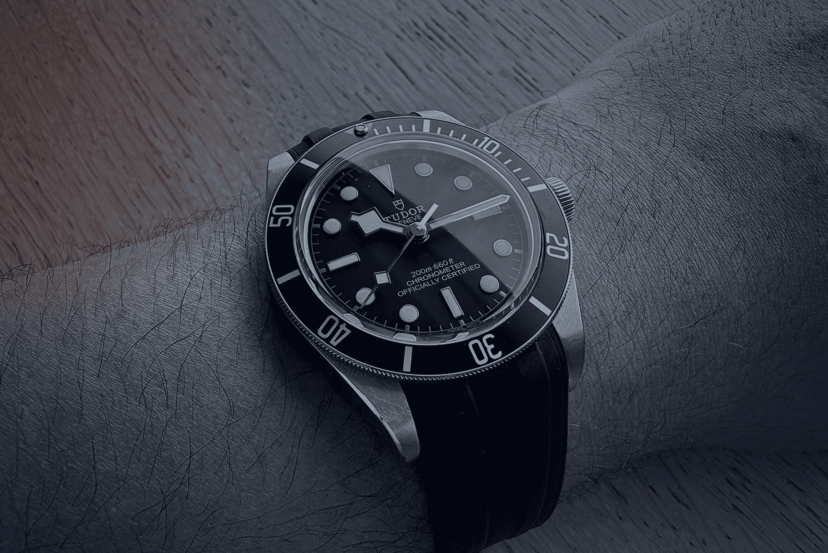
Good design should
outlast trends.
Like a good watch, it should still work beautifully in ten years.
A collection of digital experiences, identities and creative collaborations.
A collection of digital experiences, identities and creative collaborations
Branding
UI/UX
Web Design
Print Design
Selected Collaborations
A collection of digital experiences, identities and creative collaborations.
Not every collaboration needs a full case study. This collection brings together smaller projects with a clear problem, a focused solution and meaningful work behind them.
Selected Collaborations
SparkOptimus
My work in the Rijksmuseum
My artwork was exhibited at the Rijksmuseum in Amsterdam!
For the launch of SparkOptimus’s book Make Disruption Work, I reimagined a series of historic portraits by placing the newly released book into their hands, bringing a contemporary message about disruption into classical imagery.
The artworks were displayed throughout the museum during the launch event, attended by more than 200 guests. Seeing my work hanging inside the Rijksmuseum, and watching visitors stop to photograph it, was a genuinely surreal and proud moment.
About the event↗
Services
Creative Direction · Promotional Artwork · Graphic Design
Selected Collaborations
ODC Logistics
One identity across every customer touchpoint
ODC Logistics needed one clear identity that could work across every customer touchpoint and grow alongside the business.
I created the website, iconography, brochures and business cards, bringing everything together within one consistent visual system. The digital work included the information architecture, user flows, wireframes, interface design and development of a responsive WordPress website built from scratch.
Beginning with competitor research and a practical style guide, I established the color, typography, hierarchy and iconography that shaped every application. The resulting system gave ODC Logistics a more credible and professional presence, supported sales and continued to scale as the company grew in both revenue and employees.
View live website↗
Services
Brand Identity · Iconography · UX Design · Website Design & Development · Print Design
Selected Collaborations
Duckie Wonderland
A private webshop that became the blueprint for physical stores
I designed and built Duckie Wonderland’s webshop, translating its playful brand universe into a distinctive online shopping experience. The platform used restricted access: visitors could explore the collection, but prices only became visible after logging in.
More than an online store, the website established the visual and commercial direction for the many physical Duckie Wonderland stores that followed. It became a benchmark for how the brand could look, feel and behave across future locations.
View live website↗
Services
UI / UX Design · Website Design & Development
Selected Collaborations
NAHst (Non-Profit)
Making support feel visible, welcoming and accessible
NAHst is a non-profit organisation that brings people living with acquired brain injuries together through activities, shared experiences and meaningful social contact.
I created the organisation’s identity from scratch, including its logo, style guide, business cards and custom-built website. The friendly brain symbol makes NAHst’s purpose immediately recognisable, while the vivid green and pink palette gives the organisation an optimistic and approachable character.
Accessibility played an essential role in the website. Its content follows a clear, logical structure and includes speech functionality and descriptive alternative text, helping people with visual impairments navigate and understand the site more easily.
The result is a consistent and welcoming identity that gives NAHst a recognisable presence across both digital and printed communication.
Services
Brand Identity · Logo Design · Style Guide · Print Design · Accessibility · Custom HTML & CSS Development
Selected Collaborations
MCV
Turning sound into a recognisable identity
MCV provides lighting, sound, production and technical support for theatres and events. I created a new logo and business card system to give the company a more professional, recognisable presence.
The process began with research into the world surrounding MCV: live events, stage lighting, audio equipment and the technical structures behind a successful production. These references formed a moodboard that helped define the identity’s shapes, colours and overall character.
From there, I moved to pencil and paper. Sketching by hand allowed ideas to develop freely before the strongest concepts were translated into digital variations and refined together with the client.
The final symbol is inspired by audio levels and sound waves. Its geometric rhythm reflects MCV’s combination of sound, lighting and technical expertise, while the red, black and white palette gives the identity a confident and highly visible appearance.
The completed identity was applied to business cards and delivered as a flexible set of production-ready files for digital, print and large-format use.
About MCV↗
Services
Research and moodboarding · Logo design · Visual identity · Business card design · Print preparation · Brand asset delivery
Selected Collaborations
Leiden Marathon
A clearer website. Record participation.
I redesigned and developed the Leiden Marathon website to make discovering events and signing up feel clearer, faster and more inviting.
User research helped uncover what motivates runners and what information they need before committing to a race. These insights shaped the website’s structure, user journeys and wireframes before being translated into a bold, energetic visual design.
The final website was developed as a custom WordPress solution, creating a flexible platform that the organisation could easily manage and expand. Following its launch, Leiden Marathon received a record number of registrations across its running events—a fantastic result for the new experience.
View live website↗
Services
User research · UX and UI design · Information architecture · Wireframing · User flows · Custom WordPress development
Selected Collaborations
INDIANAH
Giving a first Dutch-language single its own visual voice
INDIANAH approached me to create the artwork for Kom Je Naast Me Liggen, their first single released in Dutch.
The design combines intimate photography with bold, oversized typography inspired by early twentieth-century type specimens. Its slightly roughened character gives the artwork a tactile, expressive quality while remaining instantly recognisable across different imagery.
The final visual system was adapted for the single cover and promotional assets, with every format prepared for use across streaming platforms and social media.
Listen to INDIANAH on Spotify↗
Services
Art direction · Graphic design · Typography research · Cover artwork · Digital asset production
Previous Project
A collection of digital experiences, identities and creative collaborations.
A collection of digital experiences, identities and creative collaborations
Branding
UI/UX
Web Design
Print Design
Selected Collaborations
A collection of digital experiences, identities and creative collaborations.
Not every collaboration needs a full case study. This collection brings together smaller projects with a clear problem, a focused solution and meaningful work behind them.
Selected Collaborations
SparkOptimus
My work in the Rijksmuseum
My artwork was exhibited at the Rijksmuseum in Amsterdam!
For the launch of SparkOptimus’s book Make Disruption Work, I reimagined a series of historic portraits by placing the newly released book into their hands, bringing a contemporary message about disruption into classical imagery.
The artworks were displayed throughout the museum during the launch event, attended by more than 200 guests. Seeing my work hanging inside the Rijksmuseum, and watching visitors stop to photograph it, was a genuinely surreal and proud moment.
About the event↗
Services
Creative Direction · Promotional Artwork · Graphic Design
Selected Collaborations
ODC Logistics
One identity across every customer touchpoint
ODC Logistics needed one clear identity that could work across every customer touchpoint and grow alongside the business.
I created the website, iconography, brochures and business cards, bringing everything together within one consistent visual system. The digital work included the information architecture, user flows, wireframes, interface design and development of a responsive WordPress website built from scratch.
Beginning with competitor research and a practical style guide, I established the color, typography, hierarchy and iconography that shaped every application. The resulting system gave ODC Logistics a more credible and professional presence, supported sales and continued to scale as the company grew in both revenue and employees.
View live website↗
Services
Brand Identity · Iconography · UX Design · Website Design & Development · Print Design
Selected Collaborations
Duckie Wonderland
A private webshop that became the blueprint for physical stores
I designed and built Duckie Wonderland’s webshop, translating its playful brand universe into a distinctive online shopping experience. The platform used restricted access: visitors could explore the collection, but prices only became visible after logging in.
More than an online store, the website established the visual and commercial direction for the many physical Duckie Wonderland stores that followed. It became a benchmark for how the brand could look, feel and behave across future locations.
View live website↗
Services
UI / UX Design · Website Design & Development
Selected Collaborations
NAHst (Non-Profit)
Making support feel visible, welcoming and accessible
NAHst is a non-profit organisation that brings people living with acquired brain injuries together through activities, shared experiences and meaningful social contact.
I created the organisation’s identity from scratch, including its logo, style guide, business cards and custom-built website. The friendly brain symbol makes NAHst’s purpose immediately recognisable, while the vivid green and pink palette gives the organisation an optimistic and approachable character.
Accessibility played an essential role in the website. Its content follows a clear, logical structure and includes speech functionality and descriptive alternative text, helping people with visual impairments navigate and understand the site more easily.
The result is a consistent and welcoming identity that gives NAHst a recognisable presence across both digital and printed communication.
Services
Brand Identity · Logo Design · Style Guide · Print Design · Accessibility · Custom HTML & CSS Development
Selected Collaborations
MCV
Turning sound into a recognisable identity
MCV provides lighting, sound, production and technical support for theatres and events. I created a new logo and business card system to give the company a more professional, recognisable presence.
The process began with research into the world surrounding MCV: live events, stage lighting, audio equipment and the technical structures behind a successful production. These references formed a moodboard that helped define the identity’s shapes, colours and overall character.
From there, I moved to pencil and paper. Sketching by hand allowed ideas to develop freely before the strongest concepts were translated into digital variations and refined together with the client.
The final symbol is inspired by audio levels and sound waves. Its geometric rhythm reflects MCV’s combination of sound, lighting and technical expertise, while the red, black and white palette gives the identity a confident and highly visible appearance.
The completed identity was applied to business cards and delivered as a flexible set of production-ready files for digital, print and large-format use.
About MCV↗
Services
Research and moodboarding · Logo design · Visual identity · Business card design · Print preparation · Brand asset delivery
Selected Collaborations
Leiden Marathon
A clearer website. Record participation.
I redesigned and developed the Leiden Marathon website to make discovering events and signing up feel clearer, faster and more inviting.
User research helped uncover what motivates runners and what information they need before committing to a race. These insights shaped the website’s structure, user journeys and wireframes before being translated into a bold, energetic visual design.
The final website was developed as a custom WordPress solution, creating a flexible platform that the organisation could easily manage and expand. Following its launch, Leiden Marathon received a record number of registrations across its running events—a fantastic result for the new experience.
View live website↗
Services
User research · UX and UI design · Information architecture · Wireframing · User flows · Custom WordPress development
Selected Collaborations
INDIANAH
Giving a first Dutch-language single its own visual voice
INDIANAH approached me to create the artwork for Kom Je Naast Me Liggen, their first single released in Dutch.
The design combines intimate photography with bold, oversized typography inspired by early twentieth-century type specimens. Its slightly roughened character gives the artwork a tactile, expressive quality while remaining instantly recognisable across different imagery.
The final visual system was adapted for the single cover and promotional assets, with every format prepared for use across streaming platforms and social media.
Listen to INDIANAH on Spotify↗
Services
Art direction · Graphic design · Typography research · Cover artwork · Digital asset production
Previous Project
A collection of digital experiences, identities and creative collaborations.
A collection of digital experiences, identities and creative collaborations
Branding
UI/UX
Web Design
Print Design
Selected Collaborations
A collection of digital experiences, identities and creative collaborations.
Not every collaboration needs a full case study. This collection brings together smaller projects with a clear problem, a focused solution and meaningful work behind them.
Selected Collaborations
SparkOptimus
My work in the Rijksmuseum
My artwork was exhibited at the Rijksmuseum in Amsterdam!
For the launch of SparkOptimus’s book Make Disruption Work, I reimagined a series of historic portraits by placing the newly released book into their hands, bringing a contemporary message about disruption into classical imagery.
The artworks were displayed throughout the museum during the launch event, attended by more than 200 guests. Seeing my work hanging inside the Rijksmuseum, and watching visitors stop to photograph it, was a genuinely surreal and proud moment.
About the event↗
Services
Creative Direction · Promotional Artwork · Graphic Design
Selected Collaborations
ODC Logistics
One identity across every customer touchpoint
ODC Logistics needed one clear identity that could work across every customer touchpoint and grow alongside the business.
I created the website, iconography, brochures and business cards, bringing everything together within one consistent visual system. The digital work included the information architecture, user flows, wireframes, interface design and development of a responsive WordPress website built from scratch.
Beginning with competitor research and a practical style guide, I established the color, typography, hierarchy and iconography that shaped every application. The resulting system gave ODC Logistics a more credible and professional presence, supported sales and continued to scale as the company grew in both revenue and employees.
View live website↗
Services
Brand Identity · Iconography · UX Design · Website Design & Development · Print Design
Selected Collaborations
Duckie Wonderland
A private webshop that became the blueprint for physical stores
I designed and built Duckie Wonderland’s webshop, translating its playful brand universe into a distinctive online shopping experience. The platform used restricted access: visitors could explore the collection, but prices only became visible after logging in.
More than an online store, the website established the visual and commercial direction for the many physical Duckie Wonderland stores that followed. It became a benchmark for how the brand could look, feel and behave across future locations.
View live website↗
Services
UI / UX Design · Website Design & Development
Selected Collaborations
NAHst (Non-Profit)
Making support feel visible, welcoming and accessible
NAHst is a non-profit organisation that brings people living with acquired brain injuries together through activities, shared experiences and meaningful social contact.
I created the organisation’s identity from scratch, including its logo, style guide, business cards and custom-built website. The friendly brain symbol makes NAHst’s purpose immediately recognisable, while the vivid green and pink palette gives the organisation an optimistic and approachable character.
Accessibility played an essential role in the website. Its content follows a clear, logical structure and includes speech functionality and descriptive alternative text, helping people with visual impairments navigate and understand the site more easily.
The result is a consistent and welcoming identity that gives NAHst a recognisable presence across both digital and printed communication.
Services
Brand Identity · Logo Design · Style Guide · Print Design · Accessibility · Custom HTML & CSS Development
Selected Collaborations
MCV
Turning sound into a recognisable identity
MCV provides lighting, sound, production and technical support for theatres and events. I created a new logo and business card system to give the company a more professional, recognisable presence.
The process began with research into the world surrounding MCV: live events, stage lighting, audio equipment and the technical structures behind a successful production. These references formed a moodboard that helped define the identity’s shapes, colours and overall character.
From there, I moved to pencil and paper. Sketching by hand allowed ideas to develop freely before the strongest concepts were translated into digital variations and refined together with the client.
The final symbol is inspired by audio levels and sound waves. Its geometric rhythm reflects MCV’s combination of sound, lighting and technical expertise, while the red, black and white palette gives the identity a confident and highly visible appearance.
The completed identity was applied to business cards and delivered as a flexible set of production-ready files for digital, print and large-format use.
About MCV↗
Services
Research and moodboarding · Logo design · Visual identity · Business card design · Print preparation · Brand asset delivery
Selected Collaborations
Leiden Marathon
A clearer website. Record participation.
I redesigned and developed the Leiden Marathon website to make discovering events and signing up feel clearer, faster and more inviting.
User research helped uncover what motivates runners and what information they need before committing to a race. These insights shaped the website’s structure, user journeys and wireframes before being translated into a bold, energetic visual design.
The final website was developed as a custom WordPress solution, creating a flexible platform that the organisation could easily manage and expand. Following its launch, Leiden Marathon received a record number of registrations across its running events—a fantastic result for the new experience.
View live website↗
Services
User research · UX and UI design · Information architecture · Wireframing · User flows · Custom WordPress development
Selected Collaborations
INDIANAH
Giving a first Dutch-language single its own visual voice
INDIANAH approached me to create the artwork for Kom Je Naast Me Liggen, their first single released in Dutch.
The design combines intimate photography with bold, oversized typography inspired by early twentieth-century type specimens. Its slightly roughened character gives the artwork a tactile, expressive quality while remaining instantly recognisable across different imagery.
The final visual system was adapted for the single cover and promotional assets, with every format prepared for use across streaming platforms and social media.
Listen to INDIANAH on Spotify↗
Services
Art direction · Graphic design · Typography research · Cover artwork · Digital asset production
Previous Project
Good design should
outlast trends.
Like a good watch, it should still work beautifully in ten years.
A collection of digital experiences, identities and creative collaborations.
A collection of digital experiences, identities and creative collaborations
Branding
UI/UX
Web Design
Print Design
Selected Collaborations
A collection of digital experiences, identities and creative collaborations.
Not every collaboration needs a full case study. This collection brings together smaller projects with a clear problem, a focused solution and meaningful work behind them.
Selected Collaborations
SparkOptimus
My work in the Rijksmuseum
My artwork was exhibited at the Rijksmuseum in Amsterdam!
For the launch of SparkOptimus’s book Make Disruption Work, I reimagined a series of historic portraits by placing the newly released book into their hands, bringing a contemporary message about disruption into classical imagery.
The artworks were displayed throughout the museum during the launch event, attended by more than 200 guests. Seeing my work hanging inside the Rijksmuseum, and watching visitors stop to photograph it, was a genuinely surreal and proud moment.
About the event↗
Services
Creative Direction · Promotional Artwork · Graphic Design
Selected Collaborations
ODC Logistics
One identity across every customer touchpoint
ODC Logistics needed one clear identity that could work across every customer touchpoint and grow alongside the business.
I created the website, iconography, brochures and business cards, bringing everything together within one consistent visual system. The digital work included the information architecture, user flows, wireframes, interface design and development of a responsive WordPress website built from scratch.
Beginning with competitor research and a practical style guide, I established the color, typography, hierarchy and iconography that shaped every application. The resulting system gave ODC Logistics a more credible and professional presence, supported sales and continued to scale as the company grew in both revenue and employees.
View live website↗
Services
Brand Identity · Iconography · UX Design · Website Design & Development · Print Design
Selected Collaborations
Duckie Wonderland
A private webshop that became the blueprint for physical stores
I designed and built Duckie Wonderland’s webshop, translating its playful brand universe into a distinctive online shopping experience. The platform used restricted access: visitors could explore the collection, but prices only became visible after logging in.
More than an online store, the website established the visual and commercial direction for the many physical Duckie Wonderland stores that followed. It became a benchmark for how the brand could look, feel and behave across future locations.
View live website↗
Services
UI / UX Design · Website Design & Development
Selected Collaborations
NAHst (Non-Profit)
Making support feel visible, welcoming and accessible
NAHst is a non-profit organisation that brings people living with acquired brain injuries together through activities, shared experiences and meaningful social contact.
I created the organisation’s identity from scratch, including its logo, style guide, business cards and custom-built website. The friendly brain symbol makes NAHst’s purpose immediately recognisable, while the vivid green and pink palette gives the organisation an optimistic and approachable character.
Accessibility played an essential role in the website. Its content follows a clear, logical structure and includes speech functionality and descriptive alternative text, helping people with visual impairments navigate and understand the site more easily.
The result is a consistent and welcoming identity that gives NAHst a recognisable presence across both digital and printed communication.
Services
Brand Identity · Logo Design · Style Guide · Print Design · Accessibility · Custom HTML & CSS Development
Selected Collaborations
MCV
Turning sound into a recognisable identity
MCV provides lighting, sound, production and technical support for theatres and events. I created a new logo and business card system to give the company a more professional, recognisable presence.
The process began with research into the world surrounding MCV: live events, stage lighting, audio equipment and the technical structures behind a successful production. These references formed a moodboard that helped define the identity’s shapes, colours and overall character.
From there, I moved to pencil and paper. Sketching by hand allowed ideas to develop freely before the strongest concepts were translated into digital variations and refined together with the client.
The final symbol is inspired by audio levels and sound waves. Its geometric rhythm reflects MCV’s combination of sound, lighting and technical expertise, while the red, black and white palette gives the identity a confident and highly visible appearance.
The completed identity was applied to business cards and delivered as a flexible set of production-ready files for digital, print and large-format use.
About MCV↗
Services
Research and moodboarding · Logo design · Visual identity · Business card design · Print preparation · Brand asset delivery
Selected Collaborations
Leiden Marathon
A clearer website. Record participation.
I redesigned and developed the Leiden Marathon website to make discovering events and signing up feel clearer, faster and more inviting.
User research helped uncover what motivates runners and what information they need before committing to a race. These insights shaped the website’s structure, user journeys and wireframes before being translated into a bold, energetic visual design.
The final website was developed as a custom WordPress solution, creating a flexible platform that the organisation could easily manage and expand. Following its launch, Leiden Marathon received a record number of registrations across its running events—a fantastic result for the new experience.
View live website↗
Services
User research · UX and UI design · Information architecture · Wireframing · User flows · Custom WordPress development
Selected Collaborations
INDIANAH
Giving a first Dutch-language single its own visual voice
INDIANAH approached me to create the artwork for Kom Je Naast Me Liggen, their first single released in Dutch.
The design combines intimate photography with bold, oversized typography inspired by early twentieth-century type specimens. Its slightly roughened character gives the artwork a tactile, expressive quality while remaining instantly recognisable across different imagery.
The final visual system was adapted for the single cover and promotional assets, with every format prepared for use across streaming platforms and social media.
Listen to INDIANAH on Spotify↗
Services
Art direction · Graphic design · Typography research · Cover artwork · Digital asset production
Previous Project
A collection of digital experiences, identities and creative collaborations.
A collection of digital experiences, identities and creative collaborations
Branding
UI/UX
Web Design
Print Design
Selected Collaborations
A collection of digital experiences, identities and creative collaborations.
Not every collaboration needs a full case study. This collection brings together smaller projects with a clear problem, a focused solution and meaningful work behind them.
Selected Collaborations
SparkOptimus
My work in the Rijksmuseum
My artwork was exhibited at the Rijksmuseum in Amsterdam!
For the launch of SparkOptimus’s book Make Disruption Work, I reimagined a series of historic portraits by placing the newly released book into their hands, bringing a contemporary message about disruption into classical imagery.
The artworks were displayed throughout the museum during the launch event, attended by more than 200 guests. Seeing my work hanging inside the Rijksmuseum, and watching visitors stop to photograph it, was a genuinely surreal and proud moment.
About the event↗
Services
Creative Direction · Promotional Artwork · Graphic Design
Selected Collaborations
ODC Logistics
One identity across every customer touchpoint
ODC Logistics needed one clear identity that could work across every customer touchpoint and grow alongside the business.
I created the website, iconography, brochures and business cards, bringing everything together within one consistent visual system. The digital work included the information architecture, user flows, wireframes, interface design and development of a responsive WordPress website built from scratch.
Beginning with competitor research and a practical style guide, I established the color, typography, hierarchy and iconography that shaped every application. The resulting system gave ODC Logistics a more credible and professional presence, supported sales and continued to scale as the company grew in both revenue and employees.
View live website↗
Services
Brand Identity · Iconography · UX Design · Website Design & Development · Print Design
Selected Collaborations
Duckie Wonderland
A private webshop that became the blueprint for physical stores
I designed and built Duckie Wonderland’s webshop, translating its playful brand universe into a distinctive online shopping experience. The platform used restricted access: visitors could explore the collection, but prices only became visible after logging in.
More than an online store, the website established the visual and commercial direction for the many physical Duckie Wonderland stores that followed. It became a benchmark for how the brand could look, feel and behave across future locations.
View live website↗
Services
UI / UX Design · Website Design & Development
Selected Collaborations
NAHst (Non-Profit)
Making support feel visible, welcoming and accessible
NAHst is a non-profit organisation that brings people living with acquired brain injuries together through activities, shared experiences and meaningful social contact.
I created the organisation’s identity from scratch, including its logo, style guide, business cards and custom-built website. The friendly brain symbol makes NAHst’s purpose immediately recognisable, while the vivid green and pink palette gives the organisation an optimistic and approachable character.
Accessibility played an essential role in the website. Its content follows a clear, logical structure and includes speech functionality and descriptive alternative text, helping people with visual impairments navigate and understand the site more easily.
The result is a consistent and welcoming identity that gives NAHst a recognisable presence across both digital and printed communication.
Services
Brand Identity · Logo Design · Style Guide · Print Design · Accessibility · Custom HTML & CSS Development
Selected Collaborations
MCV
Turning sound into a recognisable identity
MCV provides lighting, sound, production and technical support for theatres and events. I created a new logo and business card system to give the company a more professional, recognisable presence.
The process began with research into the world surrounding MCV: live events, stage lighting, audio equipment and the technical structures behind a successful production. These references formed a moodboard that helped define the identity’s shapes, colours and overall character.
From there, I moved to pencil and paper. Sketching by hand allowed ideas to develop freely before the strongest concepts were translated into digital variations and refined together with the client.
The final symbol is inspired by audio levels and sound waves. Its geometric rhythm reflects MCV’s combination of sound, lighting and technical expertise, while the red, black and white palette gives the identity a confident and highly visible appearance.
The completed identity was applied to business cards and delivered as a flexible set of production-ready files for digital, print and large-format use.
About MCV↗
Services
Research and moodboarding · Logo design · Visual identity · Business card design · Print preparation · Brand asset delivery
Selected Collaborations
Leiden Marathon
A clearer website. Record participation.
I redesigned and developed the Leiden Marathon website to make discovering events and signing up feel clearer, faster and more inviting.
User research helped uncover what motivates runners and what information they need before committing to a race. These insights shaped the website’s structure, user journeys and wireframes before being translated into a bold, energetic visual design.
The final website was developed as a custom WordPress solution, creating a flexible platform that the organisation could easily manage and expand. Following its launch, Leiden Marathon received a record number of registrations across its running events—a fantastic result for the new experience.
View live website↗
Services
User research · UX and UI design · Information architecture · Wireframing · User flows · Custom WordPress development
Selected Collaborations
INDIANAH
Giving a first Dutch-language single its own visual voice
INDIANAH approached me to create the artwork for Kom Je Naast Me Liggen, their first single released in Dutch.
The design combines intimate photography with bold, oversized typography inspired by early twentieth-century type specimens. Its slightly roughened character gives the artwork a tactile, expressive quality while remaining instantly recognisable across different imagery.
The final visual system was adapted for the single cover and promotional assets, with every format prepared for use across streaming platforms and social media.
Listen to INDIANAH on Spotify↗
Services
Art direction · Graphic design · Typography research · Cover artwork · Digital asset production
Previous Project
A collection of digital experiences, identities and creative collaborations.
A collection of digital experiences, identities and creative collaborations
Branding
UI/UX
Web Design
Print Design
Selected Collaborations
A collection of digital experiences, identities and creative collaborations.
Not every collaboration needs a full case study. This collection brings together smaller projects with a clear problem, a focused solution and meaningful work behind them.
Selected Collaborations
SparkOptimus
My work in the Rijksmuseum
My artwork was exhibited at the Rijksmuseum in Amsterdam!
For the launch of SparkOptimus’s book Make Disruption Work, I reimagined a series of historic portraits by placing the newly released book into their hands, bringing a contemporary message about disruption into classical imagery.
The artworks were displayed throughout the museum during the launch event, attended by more than 200 guests. Seeing my work hanging inside the Rijksmuseum, and watching visitors stop to photograph it, was a genuinely surreal and proud moment.
About the event↗
Services
Creative Direction · Promotional Artwork · Graphic Design
Selected Collaborations
ODC Logistics
One identity across every customer touchpoint
ODC Logistics needed one clear identity that could work across every customer touchpoint and grow alongside the business.
I created the website, iconography, brochures and business cards, bringing everything together within one consistent visual system. The digital work included the information architecture, user flows, wireframes, interface design and development of a responsive WordPress website built from scratch.
Beginning with competitor research and a practical style guide, I established the color, typography, hierarchy and iconography that shaped every application. The resulting system gave ODC Logistics a more credible and professional presence, supported sales and continued to scale as the company grew in both revenue and employees.
View live website↗
Services
Brand Identity · Iconography · UX Design · Website Design & Development · Print Design
Selected Collaborations
Duckie Wonderland
A private webshop that became the blueprint for physical stores
I designed and built Duckie Wonderland’s webshop, translating its playful brand universe into a distinctive online shopping experience. The platform used restricted access: visitors could explore the collection, but prices only became visible after logging in.
More than an online store, the website established the visual and commercial direction for the many physical Duckie Wonderland stores that followed. It became a benchmark for how the brand could look, feel and behave across future locations.
View live website↗
Services
UI / UX Design · Website Design & Development
Selected Collaborations
NAHst (Non-Profit)
Making support feel visible, welcoming and accessible
NAHst is a non-profit organisation that brings people living with acquired brain injuries together through activities, shared experiences and meaningful social contact.
I created the organisation’s identity from scratch, including its logo, style guide, business cards and custom-built website. The friendly brain symbol makes NAHst’s purpose immediately recognisable, while the vivid green and pink palette gives the organisation an optimistic and approachable character.
Accessibility played an essential role in the website. Its content follows a clear, logical structure and includes speech functionality and descriptive alternative text, helping people with visual impairments navigate and understand the site more easily.
The result is a consistent and welcoming identity that gives NAHst a recognisable presence across both digital and printed communication.
Services
Brand Identity · Logo Design · Style Guide · Print Design · Accessibility · Custom HTML & CSS Development
Selected Collaborations
MCV
Turning sound into a recognisable identity
MCV provides lighting, sound, production and technical support for theatres and events. I created a new logo and business card system to give the company a more professional, recognisable presence.
The process began with research into the world surrounding MCV: live events, stage lighting, audio equipment and the technical structures behind a successful production. These references formed a moodboard that helped define the identity’s shapes, colours and overall character.
From there, I moved to pencil and paper. Sketching by hand allowed ideas to develop freely before the strongest concepts were translated into digital variations and refined together with the client.
The final symbol is inspired by audio levels and sound waves. Its geometric rhythm reflects MCV’s combination of sound, lighting and technical expertise, while the red, black and white palette gives the identity a confident and highly visible appearance.
The completed identity was applied to business cards and delivered as a flexible set of production-ready files for digital, print and large-format use.
About MCV↗
Services
Research and moodboarding · Logo design · Visual identity · Business card design · Print preparation · Brand asset delivery
Selected Collaborations
Leiden Marathon
A clearer website. Record participation.
I redesigned and developed the Leiden Marathon website to make discovering events and signing up feel clearer, faster and more inviting.
User research helped uncover what motivates runners and what information they need before committing to a race. These insights shaped the website’s structure, user journeys and wireframes before being translated into a bold, energetic visual design.
The final website was developed as a custom WordPress solution, creating a flexible platform that the organisation could easily manage and expand. Following its launch, Leiden Marathon received a record number of registrations across its running events—a fantastic result for the new experience.
View live website↗
Services
User research · UX and UI design · Information architecture · Wireframing · User flows · Custom WordPress development
Selected Collaborations
INDIANAH
Giving a first Dutch-language single its own visual voice
INDIANAH approached me to create the artwork for Kom Je Naast Me Liggen, their first single released in Dutch.
The design combines intimate photography with bold, oversized typography inspired by early twentieth-century type specimens. Its slightly roughened character gives the artwork a tactile, expressive quality while remaining instantly recognisable across different imagery.
The final visual system was adapted for the single cover and promotional assets, with every format prepared for use across streaming platforms and social media.
Listen to INDIANAH on Spotify↗
Services
Art direction · Graphic design · Typography research · Cover artwork · Digital asset production
Previous Project
Good design should
outlast trends.
Like a good watch, it should still work beautifully in ten years.