
MORIQ. Intelligent work systems, shaped by people.
Creating a human-first identity for a pre-seed AI platform
Branding
Print Design
Employer Branding

Moriq
MORIQ. Intelligent work systems, shaped by people.
Moriq needed to move beyond generic AI hiring language. I created a distinctive identity around turning expert knowledge into repeatable workflows.
Moriq
Overview
MORIQ helps growing teams capture how their best people work, then turn that knowledge into repeatable AI-assisted workflows. It sits between talent, operations and software, but initially looked like it belonged to none of them.
The previous identity leaned on familiar AI clichés: cold gradients, abstract grids, and a name that suggested recruitment before it suggested capability. It made a thoughtful product feel interchangeable.

Moriq
The Challenge
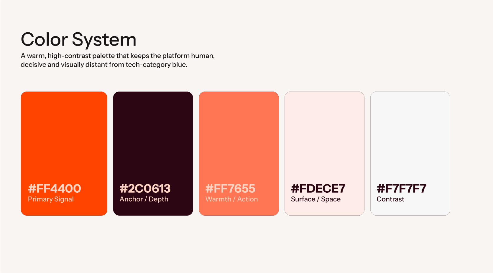
The AI software market is full of brands trying to look advanced in exactly the same way: dark interfaces, neon blue, floating nodes, a vague promise of transformation.



For MORIQ, that visual language created the wrong expectation. The platform was not about replacing people or automating work into anonymity, it was about giving expert teams more leverage, clarity and room to do their best work. The challenge was to make an AI product feel intelligent without feeling distant.
Moriq
The Full Scope
Moving away from automation, toward momentum.


Final Thoughts
From another AI startup.
To a brand with a point of view.
MORIQ left the project with clearer positioning, a distinctive visual identity and a flexible system for product, pitch and launch communication.
At pre-seed, the goal was not simply to make the company look established. It was to make a new idea easier to understand, trust and remember. Giving the team a credible foundation for conversations with investors, partners and future customers.
Positioning • Strategy • Business • Branding
The Result
Built for
what comes next.
Before
Generic AI hiring proposition
Familiar AI visual clichés
Unclear category
Interchangeable appearance
After
AI-assisted workflow platform
Warm, recognisable visual language
Clear human-first position
A brand with its own point of view
Previous Project
Next Project

MORIQ. Intelligent work systems, shaped by people.
Creating a human-first identity for a pre-seed AI platform
Branding
Print Design
Employer Branding
Moriq
MORIQ. Intelligent work systems, shaped by people.
Moriq needed to move beyond generic AI hiring language. I created a distinctive identity around turning expert knowledge into repeatable workflows.
Moriq
Overview
MORIQ helps growing teams capture how their best people work, then turn that knowledge into repeatable AI-assisted workflows. It sits between talent, operations and software, but initially looked like it belonged to none of them.
The previous identity leaned on familiar AI clichés: cold gradients, abstract grids, and a name that suggested recruitment before it suggested capability. It made a thoughtful product feel interchangeable.
Moriq
The Challenge
The AI software market is full of brands trying to look advanced in exactly the same way: dark interfaces, neon blue, floating nodes, a vague promise of transformation.
For MORIQ, that visual language created the wrong expectation. The platform was not about replacing people or automating work into anonymity, it was about giving expert teams more leverage, clarity and room to do their best work. The challenge was to make an AI product feel intelligent without feeling distant.
Moriq
The Full Scope
Moving away from automation, toward momentum.
Final Thoughts
MORIQ left the project with clearer positioning, a distinctive visual identity and a flexible system for product, pitch and launch communication.
At pre-seed, the goal was not simply to make the company look established. It was to make a new idea easier to understand, trust and remember. Giving the team a credible foundation for conversations with investors, partners and future customers.
Positioning • Strategy • Business • Branding
The Result
Built for
what comes next.
Before
Generic AI hiring proposition
Familiar AI visual clichés
Unclear category
Interchangeable appearance
After
AI-assisted workflow platform
Warm, recognisable visual language
Clear human-first position
A brand with its own point of view
Previous Project
Next Project
MORIQ. Intelligent work systems, shaped by people.
Creating a human-first identity for a pre-seed AI platform
Branding
Print Design
Employer Branding
Moriq
MORIQ. Intelligent work systems, shaped by people.
Moriq needed to move beyond generic AI hiring language. I created a distinctive identity around turning expert knowledge into repeatable workflows.
Moriq
Overview
MORIQ helps growing teams capture how their best people work, then turn that knowledge into repeatable AI-assisted workflows. It sits between talent, operations and software, but initially looked like it belonged to none of them.
The previous identity leaned on familiar AI clichés: cold gradients, abstract grids, and a name that suggested recruitment before it suggested capability. It made a thoughtful product feel interchangeable.
Moriq
The Challenge
The AI software market is full of brands trying to look advanced in exactly the same way: dark interfaces, neon blue, floating nodes, a vague promise of transformation.
For MORIQ, that visual language created the wrong expectation. The platform was not about replacing people or automating work into anonymity, it was about giving expert teams more leverage, clarity and room to do their best work. The challenge was to make an AI product feel intelligent without feeling distant.
Moriq
The Full Scope
Moving away from automation, toward momentum.
Final Thoughts
MORIQ left the project with clearer positioning, a distinctive visual identity and a flexible system for product, pitch and launch communication.
At pre-seed, the goal was not simply to make the company look established. It was to make a new idea easier to understand, trust and remember. Giving the team a credible foundation for conversations with investors, partners and future customers.
Positioning • Strategy • Business • Branding
The Result
Built for
what comes next.
Before
Generic AI hiring proposition
Familiar AI visual clichés
Unclear category
Interchangeable appearance
After
AI-assisted workflow platform
Warm, recognisable visual language
Clear human-first position
A brand with its own point of view
Previous Project

Next Project
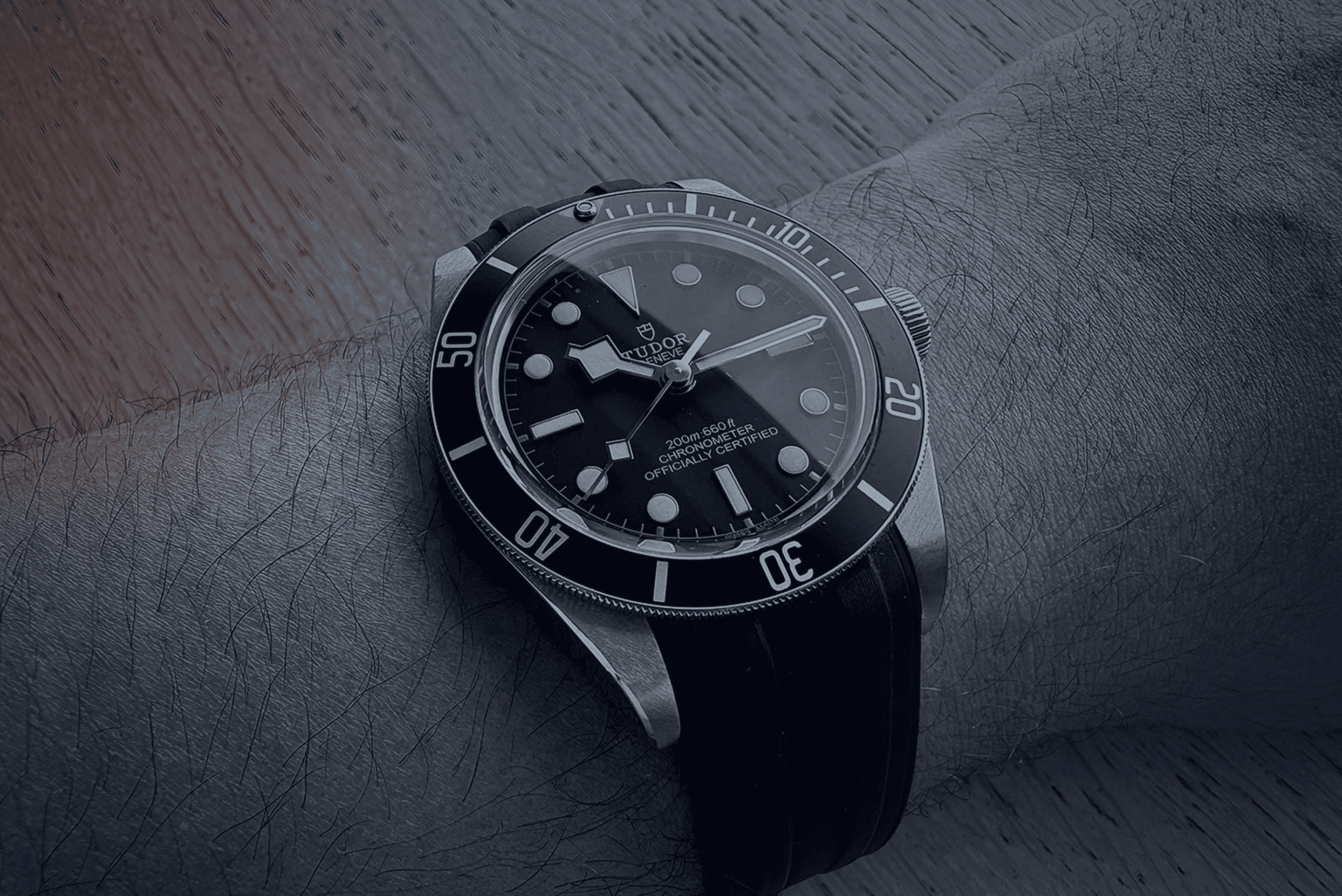
Good design should
outlast trends.
Like a good watch, it should still work beautifully in ten years.
MORIQ. Intelligent work systems, shaped by people.
Creating a human-first identity for a pre-seed AI platform
Branding
Print Design
Employer Branding
Moriq
MORIQ. Intelligent work systems, shaped by people.
Moriq needed to move beyond generic AI hiring language. I created a distinctive identity around turning expert knowledge into repeatable workflows.
Moriq
Overview
MORIQ helps growing teams capture how their best people work, then turn that knowledge into repeatable AI-assisted workflows. It sits between talent, operations and software, but initially looked like it belonged to none of them.
The previous identity leaned on familiar AI clichés: cold gradients, abstract grids, and a name that suggested recruitment before it suggested capability. It made a thoughtful product feel interchangeable.
Moriq
The Challenge
The AI software market is full of brands trying to look advanced in exactly the same way: dark interfaces, neon blue, floating nodes, a vague promise of transformation.
For MORIQ, that visual language created the wrong expectation. The platform was not about replacing people or automating work into anonymity, it was about giving expert teams more leverage, clarity and room to do their best work. The challenge was to make an AI product feel intelligent without feeling distant.
Moriq
The Full Scope
Moving away from automation, toward momentum.
Final Thoughts
From another AI startup.
To a brand with a point of view.
MORIQ left the project with clearer positioning, a distinctive visual identity and a flexible system for product, pitch and launch communication.
At pre-seed, the goal was not simply to make the company look established. It was to make a new idea easier to understand, trust and remember. Giving the team a credible foundation for conversations with investors, partners and future customers.
Positioning • Strategy • Business • Branding
The Result
Built for
what comes next.
Before
Generic AI hiring proposition
Familiar AI visual clichés
Unclear category
Interchangeable appearance
After
AI-assisted workflow platform
Warm, recognisable visual language
Clear human-first position
A brand with its own point of view
Previous Project
Next Project
MORIQ. Intelligent work systems, shaped by people.
Creating a human-first identity for a pre-seed AI platform
Branding
Print Design
Employer Branding
Moriq
MORIQ. Intelligent work systems, shaped by people.
Moriq needed to move beyond generic AI hiring language. I created a distinctive identity around turning expert knowledge into repeatable workflows.
Moriq
Overview
MORIQ helps growing teams capture how their best people work, then turn that knowledge into repeatable AI-assisted workflows. It sits between talent, operations and software, but initially looked like it belonged to none of them.
The previous identity leaned on familiar AI clichés: cold gradients, abstract grids, and a name that suggested recruitment before it suggested capability. It made a thoughtful product feel interchangeable.
Moriq
The Challenge
The AI software market is full of brands trying to look advanced in exactly the same way: dark interfaces, neon blue, floating nodes, a vague promise of transformation.
For MORIQ, that visual language created the wrong expectation. The platform was not about replacing people or automating work into anonymity, it was about giving expert teams more leverage, clarity and room to do their best work. The challenge was to make an AI product feel intelligent without feeling distant.
Moriq
The Full Scope
Moving away from automation, toward momentum.
Final Thoughts
MORIQ left the project with clearer positioning, a distinctive visual identity and a flexible system for product, pitch and launch communication.
At pre-seed, the goal was not simply to make the company look established. It was to make a new idea easier to understand, trust and remember. Giving the team a credible foundation for conversations with investors, partners and future customers.
Positioning • Strategy • Business • Branding
The Result
Built for
what comes next.
Before
Generic AI hiring proposition
Familiar AI visual clichés
Unclear category
Interchangeable appearance
After
AI-assisted workflow platform
Warm, recognisable visual language
Clear human-first position
A brand with its own point of view
Previous Project
Next Project
MORIQ. Intelligent work systems, shaped by people.
Creating a human-first identity for a pre-seed AI platform
Branding
Print Design
Employer Branding
Moriq
MORIQ. Intelligent work systems, shaped by people.
Moriq needed to move beyond generic AI hiring language. I created a distinctive identity around turning expert knowledge into repeatable workflows.
Moriq
Overview
MORIQ helps growing teams capture how their best people work, then turn that knowledge into repeatable AI-assisted workflows. It sits between talent, operations and software, but initially looked like it belonged to none of them.
The previous identity leaned on familiar AI clichés: cold gradients, abstract grids, and a name that suggested recruitment before it suggested capability. It made a thoughtful product feel interchangeable.
Moriq
The Challenge
The AI software market is full of brands trying to look advanced in exactly the same way: dark interfaces, neon blue, floating nodes, a vague promise of transformation.
For MORIQ, that visual language created the wrong expectation. The platform was not about replacing people or automating work into anonymity, it was about giving expert teams more leverage, clarity and room to do their best work. The challenge was to make an AI product feel intelligent without feeling distant.
Moriq
The Full Scope
Moving away from automation, toward momentum.
Final Thoughts
MORIQ left the project with clearer positioning, a distinctive visual identity and a flexible system for product, pitch and launch communication.
At pre-seed, the goal was not simply to make the company look established. It was to make a new idea easier to understand, trust and remember. Giving the team a credible foundation for conversations with investors, partners and future customers.
Positioning • Strategy • Business • Branding
The Result
Built for
what comes next.
Before
Generic AI hiring proposition
Familiar AI visual clichés
Unclear category
Interchangeable appearance
After
AI-assisted workflow platform
Warm, recognisable visual language
Clear human-first position
A brand with its own point of view
Previous Project
Next Project
Good design should
outlast trends.
Like a good watch, it should still work beautifully in ten years.
MORIQ. Intelligent work systems, shaped by people.
Creating a human-first identity for a pre-seed AI platform
Branding
Print Design
Employer Branding
Moriq
MORIQ. Intelligent work systems, shaped by people.
Moriq needed to move beyond generic AI hiring language. I created a distinctive identity around turning expert knowledge into repeatable workflows.
Moriq
Overview
MORIQ helps growing teams capture how their best people work, then turn that knowledge into repeatable AI-assisted workflows. It sits between talent, operations and software, but initially looked like it belonged to none of them.
The previous identity leaned on familiar AI clichés: cold gradients, abstract grids, and a name that suggested recruitment before it suggested capability. It made a thoughtful product feel interchangeable.
Moriq
The Challenge
The AI software market is full of brands trying to look advanced in exactly the same way: dark interfaces, neon blue, floating nodes, a vague promise of transformation.
For MORIQ, that visual language created the wrong expectation. The platform was not about replacing people or automating work into anonymity, it was about giving expert teams more leverage, clarity and room to do their best work. The challenge was to make an AI product feel intelligent without feeling distant.
Moriq
The Full Scope
Moving away from automation, toward momentum.
Final Thoughts
From another AI startup.
To a brand with a point of view.
MORIQ left the project with clearer positioning, a distinctive visual identity and a flexible system for product, pitch and launch communication.
At pre-seed, the goal was not simply to make the company look established. It was to make a new idea easier to understand, trust and remember. Giving the team a credible foundation for conversations with investors, partners and future customers.
Positioning • Strategy • Business • Branding
The Result
Built for
what comes next.
Before
Generic AI hiring proposition
Familiar AI visual clichés
Unclear category
Interchangeable appearance
After
AI-assisted workflow platform
Warm, recognisable visual language
Clear human-first position
A brand with its own point of view
Previous Project
Next Project
MORIQ. Intelligent work systems, shaped by people.
Creating a human-first identity for a pre-seed AI platform
Branding
Print Design
Employer Branding
Moriq
MORIQ. Intelligent work systems, shaped by people.
Moriq needed to move beyond generic AI hiring language. I created a distinctive identity around turning expert knowledge into repeatable workflows.
Moriq
Overview
MORIQ helps growing teams capture how their best people work, then turn that knowledge into repeatable AI-assisted workflows. It sits between talent, operations and software, but initially looked like it belonged to none of them.
The previous identity leaned on familiar AI clichés: cold gradients, abstract grids, and a name that suggested recruitment before it suggested capability. It made a thoughtful product feel interchangeable.
Moriq
The Challenge
The AI software market is full of brands trying to look advanced in exactly the same way: dark interfaces, neon blue, floating nodes, a vague promise of transformation.
For MORIQ, that visual language created the wrong expectation. The platform was not about replacing people or automating work into anonymity, it was about giving expert teams more leverage, clarity and room to do their best work. The challenge was to make an AI product feel intelligent without feeling distant.
Moriq
The Full Scope
Moving away from automation, toward momentum.
Final Thoughts
MORIQ left the project with clearer positioning, a distinctive visual identity and a flexible system for product, pitch and launch communication.
At pre-seed, the goal was not simply to make the company look established. It was to make a new idea easier to understand, trust and remember. Giving the team a credible foundation for conversations with investors, partners and future customers.
Positioning • Strategy • Business • Branding
The Result
Built for
what comes next.
Before
Generic AI hiring proposition
Familiar AI visual clichés
Unclear category
Interchangeable appearance
After
AI-assisted workflow platform
Warm, recognisable visual language
Clear human-first position
A brand with its own point of view
Previous Project
Next Project
MORIQ. Intelligent work systems, shaped by people.
Creating a human-first identity for a pre-seed AI platform
Branding
Print Design
Employer Branding
Moriq
MORIQ. Intelligent work systems, shaped by people.
Moriq needed to move beyond generic AI hiring language. I created a distinctive identity around turning expert knowledge into repeatable workflows.
Moriq
Overview
MORIQ helps growing teams capture how their best people work, then turn that knowledge into repeatable AI-assisted workflows. It sits between talent, operations and software, but initially looked like it belonged to none of them.
The previous identity leaned on familiar AI clichés: cold gradients, abstract grids, and a name that suggested recruitment before it suggested capability. It made a thoughtful product feel interchangeable.
Moriq
The Challenge
The AI software market is full of brands trying to look advanced in exactly the same way: dark interfaces, neon blue, floating nodes, a vague promise of transformation.
For MORIQ, that visual language created the wrong expectation. The platform was not about replacing people or automating work into anonymity, it was about giving expert teams more leverage, clarity and room to do their best work. The challenge was to make an AI product feel intelligent without feeling distant.
Moriq
The Full Scope
Moving away from automation, toward momentum.
Final Thoughts
MORIQ left the project with clearer positioning, a distinctive visual identity and a flexible system for product, pitch and launch communication.
At pre-seed, the goal was not simply to make the company look established. It was to make a new idea easier to understand, trust and remember. Giving the team a credible foundation for conversations with investors, partners and future customers.
Positioning • Strategy • Business • Branding
The Result
Built for
what comes next.
Before
Generic AI hiring proposition
Familiar AI visual clichés
Unclear category
Interchangeable appearance
After
AI-assisted workflow platform
Warm, recognisable visual language
Clear human-first position
A brand with its own point of view
Previous Project
Next Project
Good design should
outlast trends.
Like a good watch, it should still work beautifully in ten years.